Table of Contents
This chapter introduces the report elements and the various properties they provide. Properties hold strings representing different kinds of information, such as colours and fonts. The properties of the elements are listed in the Properties table of the Layout tab - some of the most commonly accessed properties are also available on a popup Properties dialog accessed by double-clicking on a report element or by choosing Properties... from its' popup menu.
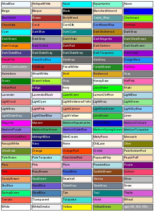
Colours in Elixir Report Designer are specified as an rgb string, in the form rgb(R,G,B,A) or by name. The R, G and B values are numbers in the range 0-255 which is the amount of red, green and blue in the colour and A is an alpha value, or transparency control, which is also a number in the range 0 (transparent) to 255 (solid). The alpha value is optional and defaults to solid, so that rgb(100,100,100) is the same as rgb(100,100,100,255). The text rgb(0,0,0) corresponds to the colour black and rgb(255,255,255) corresponds to white. While this format gives you complete flexibility in terms of colour choice, it can be hard to remember the appropriate rgb values. Therefore, as an alternative, you can enter the names of the colours, such as Black, White, even LightSalmon and SteelBlue, if you prefer. Elixir Report Designer supports the standard colour names originally defined by the X Window System and now used in SVG, HTML and CSS. The table of pre-defined colour names is shown in Figure 4.2, “Named Colours”
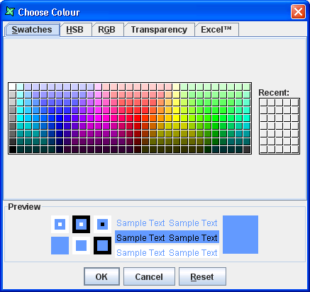
A further option is to click the button on the right of each colour field to select from a Choose Colour dialog as shown in Figure 4.1, “Choose Colour”. This dialog also allows the colour to be made partially transparent by adjusting the alpha value on the Transparency tab.
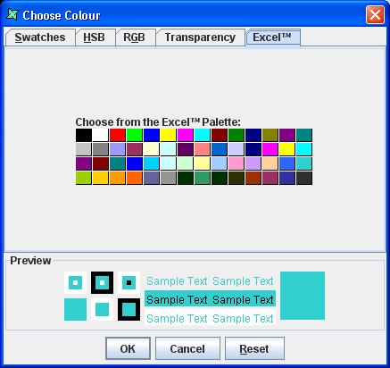
Figure 4.3, “Choose Colour (Excel Compatible)” shows the colours that are compatible with Excel since some colours
in the Swatches tab does not appear correctly when rendered in Excel.
Many elements share some common properties like background colour, border lines, etc. To avoid repetition, the common properties are described here:
The background colour is used to fill the background of a shape. It may be partially or completely transparent in which case colours will show through from objects behind.
The Bottom, Left, Right and Top border lines can be individually controlled to create interesting effects as shown in Figure 4.4, “Borders and Backgrounds”.
Borders are controlled through a number of inter-related properties, colour, width, radius and lines. The border style governs the use of these properties. Borders are rectangular, though they may have curved corners set using the radius property. Styles Groove, Ridge, Inset and Outset don't support curved corners. Double borders are created by dividing the width into three and painting the inside and outside thirds. This means the border width must be at least three pixels (60 twips) and ideally a multiple of three for the Double effect to be visible. Groove, Ridge, Inset and Outset vary the darkness of the border colour to simulate depth. The darkness of Black can't be varied, so these styles won't be visible with a black border. Finally, the Wave style uses the border width to determine the amplitude of oscillation of the line, so it needs a width greater than one to show any effect.
By default, a field will use the space exactly as drawn on the designer. When rendering longer text, it can result in the some characters being lost. To avoid this, enable Can Grow in the Properties table. When this property is enabled the report element grows in height so that all the data it contains is printed properly. Can Grow also applies to details, headers and footers. The container will grow to the height necessary to encompass all of it's children, retaining any required padding. Note that page headers and page footers can neither grow nor shrink.
Can Shrink provides the opposite facility to Can Grow. When there is no data to be displayed a the field then it is unnecessary to allocate space for that component. By using Can Shrink you allow a component to reduce height to accommodate less (or no) data. Can Shrink also applies to details, headers and footers. The container will shrink to the smallest height to encompass all of it's children, retaining any required padding. Note that page headers and page footers can neither grow nor shrink.
The Data property allows you to select the source of data to fill a Field. This property is connected to a dialog which allows you to choose from DataSource Fields, Operations, Scripts, URLs or Literal values to supply the information to show. The exact choices available vary with the kind of control.
When a value is specified for this property the first line of the field will be indented based on the specified value and the unit of measurement. If the value given is negative, then the first line will remain flush left and subsequent lines will be indented by the specified value.
The Font properties allow you to change the font name, size, colour and the style of text. While fonts can be set explicitly on individual elements, it is a good idea to define styles for fonts, e.g. TitleFont, FooterFont etc. and then reference the styles inside the report elements. This allows changes to values to be made by simply altering a style rather than manually editing every single element.
The Keep Together property is provided by containers are ensures that wherever possible, the contents of the container will be kept together on the same page of the report. When this property is enabled then the data is printed on one page instead of splitting it across two pages i.e. if it can't fit in the remaining space on one page, it will advance to the next page and render there. When this check box is turned off it prints as much as data as possible in the first page before advancing to the next page.
This property applies only to bands (details, headers and footers). If set to true, then it will ensure that the band remains on the same page as the following band. This is useful in cases where you want the header and first detail to always be together - you don't want the header at the bottom of a page and the detail on the next page. If you enable Keep With Next on the header by turning on the check box then, if there is no room on the page for the subsequent detail, it will push both the header and detail onto the top of the next page.
The Padding properties define the space between the element border and the element content. Top, right, bottom, and left padding values can be set individually. Negative values are not allowed.
This property determines the position of the element in the report layout.
Fill: If the Fill check box is selected then the element resizes itself to Fill the whole container in which it is placed. The Left, Right, Height and Width attributes can be adjusted manually here to give precise positioning which might not be achievable with a mouse.
In addition to the above properties, components which contain text, that is Data Field, Label and Data Grid also support Text align and Vertical Align.
Text Align: The Text Align field values are Left, Right, Center and Justify. The text that is displayed in the field is aligned horizontally based on the value selected from the combo box.
Vertical Align: The Vertical Align field values are Top, Center and Bottom. The text that is displayed in the field is aligned vertically based on the value selected from the combo box.
In the Image element there is a Horizontal Align property. Similar to the text align the image is aligned based on the options selected from the combo box. Unlike text alignment, horizontal alignment does not support justified mode.
Lock Handles: When this option is checked, it will lock the element in position and any resizing is impossible. When the placeholder of the element is grey in colour instead of green, it means that the particular element is locked.
Render If, On Render Begin and On Render End fields can hold JavaScripts which control the rendering of the element. By clicking the button in the fields a larger, syntax-coloured editor is available. For more information on working with scripts refer to Chapter 6, Scripting with JavaScript.
The existing styles in the report template are listed in the combo box. You can choose the required style for the element from the combo box.
There are three URL properties which are available for Chart, Data Field,
Grid, Image and Label elements. The URL property holds a URL value
(e.g. http://www.elixirtech.com) that will be used as a hyperlink jump
when the report element is clicked in render types that support linking (HTML
and PDF).
The URL Description property provides a description which may be
shown as a tooltip, if the viewer supports it.
URL Target allows the destination of the URL
contents to be set. This is primarily for use in web browsers, so you can
force the linked document to show in a separate window or frame if you choose.
The value of URL Target (if specified) will become the target attribute of the
HTML anchor (<a> element). Here is the list possible available URL targets :
Table 4.1. URL Targets
| Attribute | Value |
|---|---|
| _blank | the target URL will open in a new window |
| _self | the target URL will open in the same frame as it was clicked |
| _parent | the target URL will open in the parent frameset |
| _top | the target URL will open in the full body of the window |


