
The Cube Table element allows two-dimensional cubes to be embedded in a report. Each cube has two dimensions, one representing the table rows and one the columns. Each dimension may consist of multiple levels, defined by data fields. The records are grouped by these levels and those records forming the intersection of the row and column levels are rendered using one or more cube measures, for example Sum or Average.
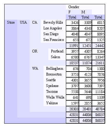
An example Cube Table output is shown in Figure 4.34, “Sample Cube Table”. There are a lot of options to control the formatting and presentation of the data.
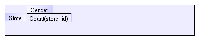
The designer view of the cube table shown above is illustrated in Figure 4.35, “Cube Table Designer View”. Within the cube table you can see three additional subcomponents - the Row Header (called Store) the Column Header (called Gender) and the Measure Count(store_id). Any additional measures will also appear here.
To create a Cube Table, click on the icon and drag a rectangle at the desired
location on the report. A wizard will appear that allows you to choose the
datasource from which the table will be built. You can choose the range of records
to be used in formulating the report, either Over All, Over Group (useful if the Cube Table
appears inside a Group Header or Footer), or Over Record. Usually you will choose Over All
or Over Group. The next step is to click "Open Cube Wizard...".
The Cube Wizard is described in the Elixir Data Designer documentation (See Elixir Data Designer.pdf, Chapter 4). The only difference between the Cube Wizard in Data Designer or Dashboard and the Cube Wizard in Report Designer is an additional Cube Option - Show Row Header Labels. If this option is selected, the labels will be colored according to the Row Header colors, and the labels will use the text of Row Total titles.
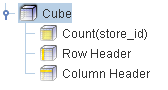
In Cube Wizard, a sequence of pages takes you through the definition of hierarchies, dimensions and measures for the cube, based on the chosen DataSource. Clicking Finish will add the Cube Table to the Report and it will appear in the Shape tree as shown in Figure 4.36, “Shape Tree View”. Each dimension and measure in the Cube Table has distinct properties, as does the Cube Table as a whole.
The Cube Table can grow wide when there are lots of elements in the column dimension. Two additional properties are available to control how the table is sized. "Width Can Grow" and "Width Can Shrink" indicate whether the table can be resized to best fit the horizontal size of the contents. You will notice in the example above that the rendered Cube Table is narrower than the design mode version. This is because the cube has Width Can Shrink set to true. Note than when Width Can Grow is set to true, it will still be clipped to the number of horizontal pages you have chosen in your page setup.
Each header defines two background colours, "Top Left" and "Bottom Right". Because each header may contain multiple levels, each level is represented by a step in the gradient of colours from TopLeft to BottomRight. If you choose the same colour for both, then every level will have the same colour. Note you can vary colours by transparency, in which case each level will gradually fade to white (or whatever colour you set the Cube Table background to). Border lines can also be turned on or off on different sides to highlight the levels in the tree.
Each measure has properties similar to a Field: alignment, padding, format etc. In addition, each measure has a Properties panel to control presentation. A sample presentation is shown in Figure 4.37, “Measure Presentation Options”.
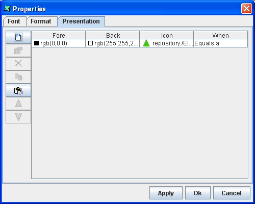
The presentation options consist of a list of tests, which might be content tests, e.g. Value > 1000 or may be structure tests, e.g. RowLevel==3. Each test is associated with a foreground and background colour, and an optional icon. When formatting a value for display, the list of conditions is scanned from top to bottom looking for a match. When a test returns true, then the associated foreground, background and image are used to render that value. Once a match is found, subsequent tests are ignored.
The most flexible presentation test is through JavaScript. Several variables are predefined so that you can use them in your tests.
- Col: The current column (zero-based).
- ColLevel: The current column level, zero for normal columns, one for totals, two for next level totals etc.
- Row: The current row (zero-based).
- RowLevel: The current row level, zero for normal rows, one for totals, two for next level totals etc.
- Value: The value of the measure.
The sample shown above sets the background to white for all "normal" rows (i.e. not totals) as shown in the cube table at the beginning of this section. Combinations of these conditions allow for very flexible value rendering. For example, RowLevel==0 && Value>100 will test true for those normal elements whose value is greater than 100, but won't include totals (which are usually bigger).