In this section we will discuss the Report and Layout panels.
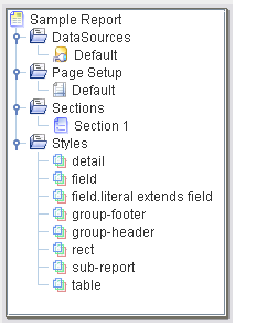
The Report tab includes a tree view of the structure of the report template, the Render Sequence panel and the Parameter panel. The structure of a report template is shown in Figure 3.2, “Report Tree”. Each template consists of the DataSources, Page Setup, Sections and Styles.
The root item of the tree is the report itself. From the popup menu you have access to the Report Properties (Figure 3.3, “Report Properties”. Here you can change the report name, control settings that apply across the report and control any RenderBegin and RenderEnd scripts for the report as a whole. The RenderBegin script will run before the first section is rendered. This means that it happens before the render sequence is used and before any data is loaded. Therefore you can control the render sequence programmatically from here. The RenderEnd script is run after all appropriate sections have been completely rendered, allowing some clean up, if necessary.
Keep Page Count this property is enabled by default, allowing you to use page count substitutions (i.e. ${##}) within your report. Page counting is expensive because the whole report needs to be kept in memory until the page count is known, only then can the first page be output (presumably showing the page count). If you don't need to show an overall page count you will get much better memory use by turning this off. PDF output format is special, in that it allows page counts to be forward referenced, so page counts will still work in PDF even with this option disabled. Therefore for optimal PDF output (smallest memory use), you should disable this. In all other formats, you will get a value of 0 for page count if this flag is not enabled.
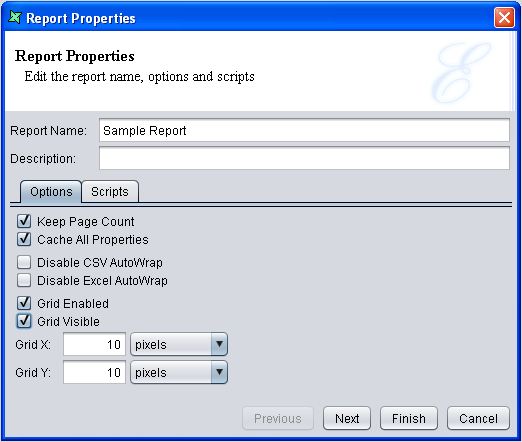
Cache All Properties this property is enabled by default. When rendering a report, each component has an explicit or implicit style associated with it. Searching for the appropriate property to apply requires checking both the parent hierarchy and any style hierarchy. This is expensive to perform repeatedly. If you know that the styles will not change while the report is being rendered, it is best to cache the styles at the start. This means any subsequent scripted style changes won't be used. If you are manipulating styles at runtime, using scripts, then set this value to false, to ensure the renderer knows the styles are volatile and always identifies the correct style property.
Disable CSV AutoWrap this property controls the wrapping of text onto multiple lines. By default text in fields is separated at word breaks and those words are moved to the next line when the field width has been reached. This is usually not appropriate for CSV where there is no field width to consider and the whole record is on one line. By selecting this option, long text that might wrap onto multiple lines is all retained as a single line when rendering into CSV.
Disable Excel AutoWrap this property controls the wrapping of text onto multiple lines. By default text in fields is separated at cell breaks and those cells are moved to the next line when the field width has been reached. This is not always appropriate for Excel where there is no field width to consider and the number of cells vary in each file. By selecting this option, long text that might wrap onto multiple lines is all retained as a single line when rendering into Excel.
Grid Enabled this property enables users to define a snap-to-grid for all components in the report template. This allows for accurate placement and sizing of report components.
Grid Visible this property enables users to decide whether the grid dots will be visible in the report template. To customize the appearance of grid, users can specify pixel values in the Grid X and Grid Y fields.
Note
Once you have positioned your components, you can use the Lock property available for each component on the property sheet. This will prevent the components being accidentally nudged.
If a datasource was chosen from the Add Report Template wizard then a reference to it will be included as the 'Default' DataSource. A datasource reference is a short name for a datasource file in the repository. For example, the full path might be "repository:/Workspace/Samples/Employee.ds", but the reference name can just be "Employee". A datasource reference also holds values for any dynamic parameters that the datasource requires. You can add or modify the datasources that the report references using the popup menus in the tree. A report can only use datasources that are listed here, and refers to them by their reference name. Any number of data sources can be defined; each must have a reference name. You can include the same datasource more than once (with different reference names), to allow variations in dynamic parameters, or independent iteration through the records.
Each datasource may be accessed in one of two modes: Table mode or Streamed mode. There is a checkbox on the DataSource wizard to control this. The default is Table mode. When operating in Table mode, the records are loaded into memory so that they can be sorted and grouped and so that you can query the total number of records etc. In Streamed mode, only a single record is loaded into memory at one time, which greatly improves the memory efficiency, but prevents complex operations that require access to more than one record. Streamed mode is best suited for billing operations etc. where each customer record has no connection with prior or subsequent records. If you turn off Table mode (therefore adopting Streamed mode) then any operations which depend on the presence of the table, such as sorting, grouping and cross-record operations will fail.
There are two ways of opening a datasource when a report template is already opened. First,
in the Data|Shapes|Styles tree panel, right-click on the datasource then select
Open DataSource. The same procedure applies to the datasource(s) listed under
the Report tab.
A DataSource reference can be copied using the popup menu and pasted into another report template. It can also be pasted into the same report, to make a copy before modifying it.
Datasource(s) added in the Report Tree
can do filtering of data without the use of Composite datasource. However, this is only
restricted to filtering. In order to do other processing, Composite datasource must be used.
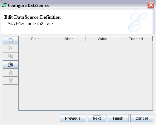
To filter, right-click or double-click on the datasource listed in the
Report Tree then click Next, which leads to the
page to add filter(s) to the datasource, as seen in Figure 3.4, “Add Filter For DataSource”.
The other way of doing it will be through the Data tab on right of
report layout. Right-click on the datasource and select
Edit DataSource..., then the Next button.
The page will be identical to the one seen in Figure 3.4, “Add Filter For DataSource”.
When a Report Template is created, a 'Default' Page Setup will be added under the Page Setup section of the tree. Each section of the report can have it's own page setup, or several can share the same one. This allows reports to combine landscape and portrait sections, or multi-column and single column sections within the same report. Popup menus on the tree provide the usual abilities to add or modify page setups. The Page Setup Wizard appears as shown in Figure 3.5, “Page Setup”.
The paper type is selected from the Paper combo box. The width and height of the paper type will be automatically entered in the corresponding text boxes and the unit of measurement from the combo boxes.
The page orientation, either Portrait or Landscape, can be selected by clicking on the corresponding option button. The number of horizontal pages that the report will span have to be specified in the Horizontal Pages field. The left, right, top and bottom margins are entered in the corresponding text boxes and the unit of measurement from the combo box. You can set the unit of measurement you want to use by default from the Global Properties button on the workspace toolbar.
The Column count is entered in the text box. Most reports are "Down Then Across", which means the content flows down one column before proceeding to the next. Some templates, such as labels may be need to be "Across Then Down" - each band of the report, e.g. each detail is laid out in subsequent columns of the same row, returning to the first column of the next row when a row is complete.
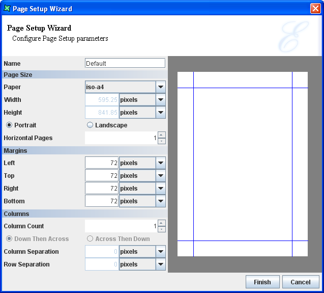
The Column Separation specifies the space between two columns. Similarly, the Row Separation corresponds to the space between the rows of data.
A Page Setup can be copied using the popup menu and pasted into another report template. It can also be pasted into the same report, to make a copy before modifying it.
Note
By default the measurement units of all the fields in the Page Setup is set to pixels. If desired you can change the default measurement type. This can be done by clicking on the Global Properties icon. The Global Properties Wizard appears. In the ERD tab, select the measurement type from the Default Units combo box and click on the Ok button.
Every report template will have at least one section. A new section
can be added using the popup menu of the Sections node. The newly added section
will be added to Render Sequence automatically.
The Sections Properties Wizard appears as shown in Figure 3.6, “Section Wizard”. It consists of four tabs: Section, Group and Sort, Watermarks and Scripts.
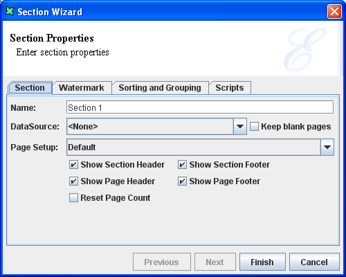
Section
The name of the section is entered in the text box and the datasource is selected from the DataSource combo box. A section can have no datasource, in which case it will still have a section header and footer, but no details will be generated. This can be useful for special purpose sections, such as cover pages or watermarks.
The "Keep blank pages" check box is selected if any blank pages produced during generation should be preserved. Blank pages are usually the result of combinations of page breaks due to the way the report is defined and should usually be discarded. Each section may contain a page header, section header, section footer and page footer. A section header is shown before any details, starting on the first page and a section footer is shown following any details.
By default each section after the first one will increment the page number as a continuation of the previous section. If you need the page number to restart again at 1 then select the "Reset Page Count" checkbox. This will break the report into logical page sequences which will each have individual numbering and page totals. You can also begin a new page sequence within a section by adding an explicit page break with a Reset Page Count option.
A Section can be copied using the popup menu and pasted into another report template. It can also be pasted into the same report, to make a copy before modifying it. A report can have any number of sections.
Within a section, you can refer to fields belonging to the section datasource by their field names. You can also refer to fields belonging to other datasources, but you need to refer to them by their full name, for example the field Salary in the datasource named Employee would be known as Salary if Employee was the section datasource or as Employee:Salary otherwise. You can only refer to fields in datasources that are referenced by the report template.
Watermark
A watermark can be a valuable addition to your report – whether you want to enhance the appearance of the document by adding a seal or image or whether you want to add a text watermark that identifies the report contents as a draft or confidential information, the watermark feature in report is a definite asset for the users.
A watermark may contain graphics and text that appears behind the main text of the report. It is usually a lighter shade than the text, so you can read the report easily. Watermarks add visual attention and a professional look with the use of imagery such as logos.
Watermarks are very flexible in Elixir Report Designer - a watermark is just another section, either belonging to this template or a section from any other template in the repository, that is shown behind the main information on page. This means anything you can do in a section can be done in a watermark. A watermark can contain traditional text and images, but also data, charts, tables subreports etc.
When using a section as a watermark you need to consider it's data requirements. If the section has no datasource, for example it is just an image or literal text, you can leave the datasource blank. Also, if the section has a datasource then that source will be used by default, there's no need to redefine it here. The only time you need to set the watermark datasource is if you need to supply a missing datasource (the section needs one, but doesn't define one) or if you want to override the existing datasource.
Group and Sort
Grouping is done for categorization of data into various logical collections. Sorting is to arrange the data in ascending/descending order.
In the Group and Sort tab there are four columns Name, Sort Order, Group On and Group Data and 5 buttons Add, Edit, Move Up, Move Down and Remove.
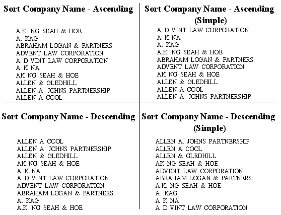
On clicking the Add button the Sort dialog appears. Select the name of the Field to be sorted from the combo box. Select Ascending, Descending, Ascending(Simple) or Descending(Simple) Sort Order from the combo box.
The difference between Sort (Ascending, Descending) and Sort(Simple) Order:
- Sort follows a proper dictionary sort algorithm whereby spaces are ignored. Sort(Simple) doesn't follow the proper full sort definition, instead it treats every character as significant.
- Dictionary sort in the order of symbols first followed by alphabet, ignoring any spaces in-between the words. Sort(simple) is in the order of spaces, symbols then alphabet.
- Sort(Simple) is especially useful when sorting data that contain any symbols, abbreviation, initials and spaces. An example as shown in Figure 3.7, “Difference between Sort and Sort (Simple)”.
If your datasource is already sorted (e.g. as a result of an SQL "ORDER BY" clause), then you can select None here. Select the Group On option from the combo box. If a range, substring, etc. is selected as a Group On option then a text box appears where we can specify the value for that range or substring based on which the grouping will be done. The Show Group Header and Show Group Footer check boxes are selected if required. On clicking the Ok button after entering the values in the Sort dialog they are assigned to the corresponding Name, Sort Order, Group On and Group Data columns in the Wizard.
Scripts
There are three text fields for Render If, On Render Begin and On Render End functions. The JavaScript functions that are entered in these text boxes are executed when the report section is rendered. For a detailed explanation of the interactions of scripts when rendering refer to Chapter 6, Scripting with JavaScript.
After setting the values in the tabbed panes and clicking the Finish button, the section is added under the Sections node of the report template.
A Section can be copied using the popup menu and pasted into another report template. It can also be pasted into the same report, to make a copy before modifying it.
Every Report template will have a set of styles. When a new Report template is added, the default style settings will be included for the report elements in the Styles node.
The default style can be edited to suit your requirements. A new Style can be added by selecting Add Style from the Styles popup menu. On selecting Add Style from the popup, a Wizard appears as shown in Figure 3.8, “Style Wizard”.
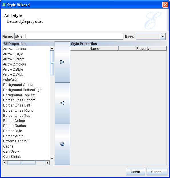
The name of the Style is entered in the text box. Select the style to be included in the report from the All Properties list box and click the '>' button. The style properties will be added to the Name column and the property can be specified in the value column.
The Base combo box contains the list of styles that have been added to the report template. This is an optional field. If you want to add a new style based on an existing style then select a Base style from the combo box. The new style will inherit the style properties from the base style that has been selected. That is the style properties of the Base style will be included along with the style properties that have been set in the new style. So when the new style that extends the base style is selected for any particular field the style properties of both the base style and the new style will be set for the field. On clicking the Finish button after setting the properties the style will be added to the Styles section.
If you want to edit an existing style then select Edit Style from the popup menu of the Style. A style can be copied from one report template's Styles section and pasted in the another report template Styles section. It can also be pasted into the same report, to make a copy before modifying it.
The order of precedence in checking styles and their description are given below:
Explicit Named Style: An element placed in the report layout first checks if has a style associated with it. If for instance a style has been defined in the master and sub report then the element placed in the sub report first looks for the style name starting with that of the master report and then the sub report. If there is a style with the similar name in the master report or the sub report then that style applies to the fields. This is an explicit named style.
Implicit Style: If there is no associated style then the element looks up whether there is any default style for this kind of element i.e. if it is a literal field then it takes the "field-literal" style. See the RML Raw Model document for the style names associated with each kind of component.
Inherited Style: The style associated with the parent of this element. If for example the detail has some style associated with it then all the elements placed in the detail section will get that style.
Finally, if there is no match found, then it makes use of the global style which is fixed as black.
Some styles can be inherited from the parent, others cannot. The styles that can be (defined by CSS) include FontName, FontColor, FontSize, FontBold, FontItalic FontUnderline and FontStrikethrough.
Initially, when a report template is added to the repository it contains a default section. When a template contains multiple sections, it is the Section Invocation table that controls the order of section rendering. The initial configuration of the Section Invocation details shows the default section is enabled for rendering.
If a new section is added to the report template and this section has to be rendered then click on the New button on the Section Invocation panel. The Render Sequence Wizard appears as shown in Figure 3.9, “Render Sequence”. The render sequence can include sections from both this report template and other reports in the repository. Choose the report (if not the current report) and then select a section name from the combo box. You can also choose to specify a datasource, which will override any datasource defined with the section itself. This allows the same section to be used repeatedly in the render process, with a different datasource each time.
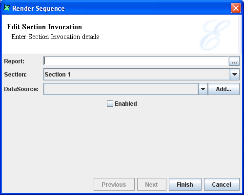
The Section Invocation details can be edited by double clicking on the column. The Render Sequence Wizard appears in which the values can be altered. On clicking the Finish button the values in the column will be edited.
If there is more than one row specified in the Render Sequence table, then the sequence in which the sections are being rendered can be changed by selecting the column and clicking on the Up/Down arrow button.
The Parameters panel is a table containing Name, Value and Enabled columns. The parameter name and value are entered in the corresponding columns of the table. The Enabled column contains a check box which can be selected to enable the parameter.
The parameters are used to control the way a report is rendered. The parameter can also be used to control data like selecting a range of employees from a list of employees.
If the "Propagate data source parameters to report" check box is selected in the Choose DataSource screen of the Report Wizard then any datasource parameters are added to the Parameters panel.
When the Propagate data source parameters to report check box is not selected in the Choose DataSource screen of the Report Wizard while adding a report template then the parameter name and value can be added later. Similarly if you switch over to another data source from the existing data source or add a new data source that may contain parameters then you can add the parameter name and value to the Parameters panel by clicking the New button.
The Parameter details that has been added to the Parameters panel can be edited or deleted by selecting the row and clicking the corresponding button. You are allowed to have multiple parameters with the same name, but only one can be enabled at a time. This allows you to store alternate sets of parameters for different situations without having to re-enter the values.
The Layout tab was shown earlier in Figure 3.1, “Report Layout”. It contains the Navigation bar at the top, the parts of report such as headers, footers, etc and the markers in the central panel, the toolbar containing the report components on the left and the Data|Shapes|Styles tree panel and the Properties panel on the right.
Navigation Bar
The Navigation Bar contains the Zoom and Section combo box. The Zoom combo box contains the Zoom percentage. You can select the desired Zoom percentage from the combo box based on which the Report parts will be Zoomed.
The Section Combo box contains the list of sections of the report template. You can select the section for which the layout has to be modified.
The Redo button changes back the element to the previously
changed stage and Undo button reverts the element back to the state
before the change.
The Render Report button is used to open the Render Wizard, as shown in Figure 3.10, “Render Wizard”, to guide you through the report rendering process. Select an output type from the icons shown and click Next to edit any custom properties of that output type. Alternatively, you can immediately press Finish to use the default properties (or the values selected previously, if you are rendering the same report again). The different output types are explained in detail in Chapter 5, Report Rendering and Output Formats.
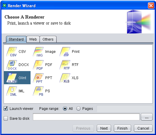
If you want to repeat a render with the same output type and parameters, you can choose the Repeat Render button, which will by-pass the wizard.
Toolbar
The toolbar contains a set of elements that can be used for adding more features and elegance to the reports. The description and properties of the report elements will be covered in the next chapter on Report Elements.
Horizontal and Vertical Rulers
The horizontal and vertical rulers are used like a scale for page measurements. By default the width of all the headers and footers in the reports layout remains the same.
The height of the headers and footers can be altered in a report. The vertical rulers are used to measure the height of the headers, footer and the detail sections.
The Expand/Collapse button is used to expand or collapse the report parts(headers, footers, etc). When a part is initially in the expanded state click the [button icon] button to collapse it. Then the part get collapsed and you will not be able to work in it. Then if you click the [button icon] button to expand it the parts will get expanded and you can continue working on it.
The markers on the horizontal and vertical rulers are used to insert guidelines. To insert your own guideline, simply click in the horizontal or vertical ruler - a red triangle will appear. To align the fields, drag them to the guidelines. The benefit of using guidelines is that you can move the guideline markers on the ruler and all the elements currently snapped to the guideline will automatically move. For Instance, if you place a horizontal guideline in the report header then drag all the column heading labels to the guideline, you can then reposition the guideline marker to automatically move all the column headings up or down. This saves you from selecting and moving each of the column heading labels manually. .
When the markers are no longer required then they can be removed by opening the marker popup menu and choosing "Remove" or by dragging them to the edge of the report layout.
Report parts
The illustration shown in Figure 3.11, “Sample Layout” depicts a typical layout. Although the particular arrangement of these parts will vary depending on the report type and style you have selected, the part themselves remain constant and can be manipulated in a variety of ways.
The page header typically contains information relevant to the particular page viewed. The page header might contain the page number, column headings, border lines or a bitmap. The text and data of this page is automatically printed after the top margin of every page.
The page footer probably contain information relevant to that particular page viewed and appears at the bottom of every page. It may be used to print the page total or other pertinent text. Page headers and footers can contain static content, but they are more commonly used to display varying content like page numbers or information about the contents of a page.
The section header contains information of the section which will be displayed at the beginning of each section and footer contains information of section and is displayed at the end of each section in the report.
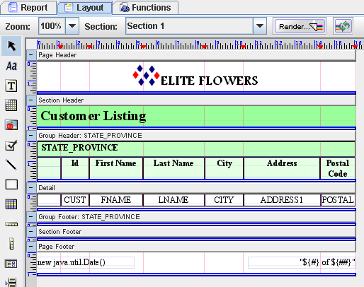
Group header present information about the particular data group being viewed - for instance the group name and a brief description about the data contained in the group and appears at the beginning of a new group of record. Group footers might contain totals or other similar information that appears at the end of each group. Group headers and footers can be added by turning on the corresponding check box when adding the group column in the Group and Sort tab of the Section.
The Detail section contains the main body of the report's data. The detail section prints individual records, and repeats until all records have been printed. You may expand the Detail section to place multiple fields above or below each other.
Field labels name specifies fields displayed in the report. By default Elixir Report Designer uses the field names from the original data source as the field labels in the report, but you can edit the field labels as needed.
Fields are items of data, from the data source specified in your report.
Data|Shapes|Styles tree panel
This panel consists of the the Data tab, Shapes tab and Styles tab.
The Data tab contains the tree view representation of the DataSources that this report references. A new datasource can simply be added under Data tab by drag and drop from Elixir Repository to Data tab. The DataSource fields can be directly selected from the Data tab and placed inside the report layout. The popup menu provides a Refresh option to update the tree if the datasource structure has changed.
The Shapes tab contains the tree view representation of the report parts and the type and names of the fields placed in the layout headers, footers, etc.
The Styles tab contains the tree view representation of the styles of the report parts, fonts, fields placed in the group header, group footer and section label etc. Styles can be added to adjust the report outlook and alignment etc.
Properties Table
The Properties table contains the Name and the Property column. The property name and the corresponding values are listed in the Properties table. When a part of the report or the field placed in the layout is selected then the corresponding properties are listed in the table.