The grid content type is a special kind of table. The grid renders one field from each record and allows for a more compact representation, where the fields may be displayed in a grid layout.
Before rendering, any duplicate fields are removed and the values can optionally be sorted. When you select a field in the grid, you are actually selecting all records in the datasource that have that selected value. For example, with a grid showing the Field "Month", selecting "April" will select all records where Month=April.
When designing a grid, you can choose a direction, Across, then Down
or Down, then Across, and either length in that direction.
For example, a "4 Across, then Down" grid will place the cells like this:
			1  2  3  4
			5  6  7
There will be four cells in each horizontal row, and the fields will be added across then down. Alternatively, a "3 Down, then Across" grid would look like this:
			1  4  7
			2  5
			3  6
In this case there are four cells vertically and the fields are added down then across.
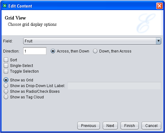
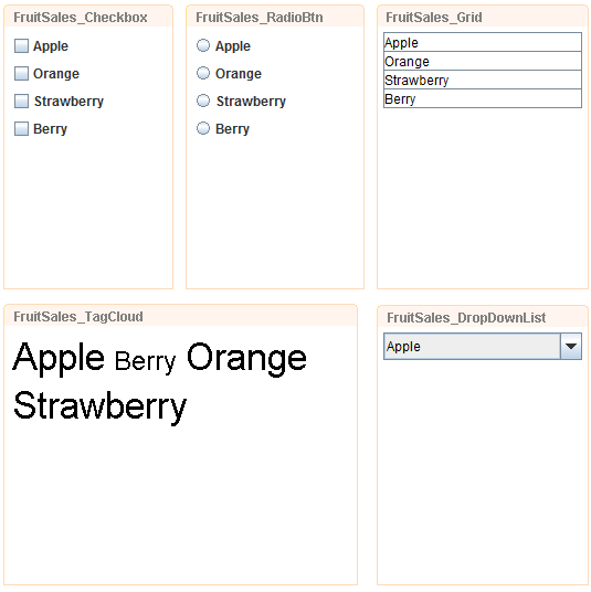
A grid can also be displayed as a Drop-Down list. This can be done on the second page of the Add Content wizard. The second page of Add Content wizard is shown in Figure 2.11, “Add Content Wizard”. The normal behaviour of grid selection is to turn off other selections each time a new selection is made (unless Control is held down). The grid also includes a Toggle Selection option which changes the behaviour so that the first click selects an item and a subsequent click on the same item is required to deselect it. This behaviour is often preferred as it prevents accidentally losing a set of existing selections by forgetting to press Control.
Check on the checkbox that says "Show as Drop-Down List" to create a Drop-Down list. Enter a name for the Label so a name will be displayed beside the Drop-Down list in the Dashboard. See Figure 2.11, “Add Content Wizard”. Note that the Sort in Figure 2.11, “Add Content Wizard” overrides the Sort in the earlier page of the wizard.
Checking on the checkbox that says "Show as Radio/Check Boxes" will create checkboxes.
To create radio buttons, check the Single-Select option.
Checking on the checkbox that says "Show as Tag Cloud" will create a Tag Cloud, which consists of tags in different font sizes, depending on their frequency shown in the records. Upon your selection of the tags, corresponding records would be displayed in the view of the related table. Multiple selections are supported.
Available datasources: All, Selected, Unselected.

