A SWF Chart is very similar to the Chart used in Report Designer. The only difference is only the appearance and the variety of chart types available.
-
In a newly created perspective, drag FruitSales.ds into the
blank space and select
Add Table. -
After clicking on
Nextonce, click onFinish. -
Next, drag FruitSales.ds to the right of the Table
and select
Add SWF Chart. -
In the
Viewtab, click on FruitSales, then select the optionSelected. This will mean that the SWF Chart will display data according to the selected row. - On the next screen, sorting can be done according to requirements. This case study is to illustrate the creation of a simple SWF Chart, so we will skip that.
-
After 3 clicks on the
Nextbutton, choose a desired chart type. We will use a Column Chart in this case study. It can be seen that the variety of charts available is lesser compared to the usual chart variety. This is because SWF Charts can only be applied to few particular types of charts. -
On the next page of the wizard, select Company under the
Keytab. -
In the
Valuestab, check all the available checkboxes. -
In the
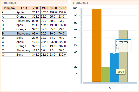
Grouptab, select On Value for theGroup ondrop-down list and select Sum for theOperationdrop-down list. Then click onFinish. - In order to see the SWF Chart, it has to be opened from Repertoire Server web interface. When the Perspective is opened, it will look like Figure 2.25, “SWF Chart”. SWF Chart itself will display data of a particular column on a mouse rollover.
- Try clicking on other rows in the Table element. The SWF Table will react based on the data selected and you will be able to see the chart in action.