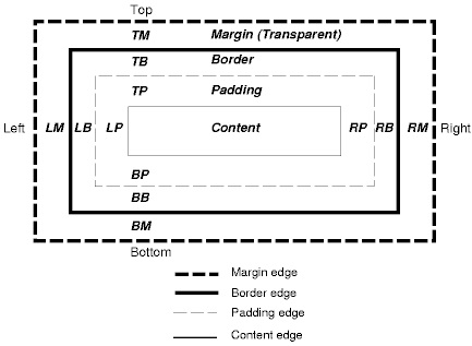
Each kind of content has some common presentation characteristics, along with some content-specific ones. These are all editable from the Presentation Wizard, accessible from the Presentation popup menu item. The common characteristics are:
- Padding
Padding is the area inside the border, which provides insets for the content area. The background of the padding is set according to the background colour of the content. See Figure 2.4, “The W3C CSS Box Model”.
- Margins
Margins is the area outside the border, which provides insets for the border rectangle. The background of the margins is set according to the background colour of the card that the content is shown on. See Figure 2.4, “The W3C CSS Box Model”.
- Background
The background colour is used to fill the background of the border and padding rectangles, along with the content area. If no background is specified then usually the card background will show though (this depends on the content type and other content-specific backgrounds).
- Title Bar Tip
Title Bar Tip is a field for entering some text for the tooltip. The tooltip will appear when a cursor is placed over the top bar of the element's content border. You will need to enter some text under Title Bar Tip and apply border to the element before any tooltip can be seen.
- Border Name
A Border is a set of images in a repository folder that are used to construct a frame around the content (and padding). To select a border, you need to select the folder that contains the images. There are a number of samples provided in /ElixirSamples/Resources/Borders, for example you might choose /ElixirSamples/Resources/Borders/Lavender. You can create your own custom borders by following the examples. Your borders don't need to have images on all sides of the frame. Any missing images will just appear blank. It is important for correct web display that the widths and heights of all images are consistent. For example the heights of topleft, top and topright images must be the identical.
- Border Title
If a border is chosen that supports titles (if there is a title.xml in the border folder), then any text entered here will be placed on the border using the information provided by the title.xml. You may either use a fixed text string, or substitutions. The available substitutions are:
- ${ContentName}
- the name of the content
- ${ViewName}
- the name of the view
- ${ShortDate}
- the short form of the current date
- ${ShortTime}
- the short form of the current time
- ${=JavaScript}
- Any JavaScript (after an equals (=) will be evaluated at runtime and the result substituted.
- ${view:ViewName.Selection:Field}
- The field name of the selected/unselected record in a particular view. However, the element must be refreshed before being able to show the updated border title. An ideal way of utilising this feature will be using on an element that displays data based on the selected/unselected of a view. This will be discussed later in the case study.
You can mix these, for example "${ContentName} : ${ShortDate}" will show both the content name and short date in the title. For other titles, you can use script substitutions, like this: ${=java.lang.System.getProperty("java.version")}. Any JavaScript syntax (which can call Java, as shown) inside a ${=JavaScript} substitution will be evaluated when the title is shown.
